Hi, I’m Darius. Creative Direction & Moment Making.

Ideas should move people.
So should the work.

I turn strategy into identities, environments, and moments people can step into. I’ve curated a few stories here to show how I think, make, and carry an idea all the way through.
Make history present

History isn't static.
Neither is identity.

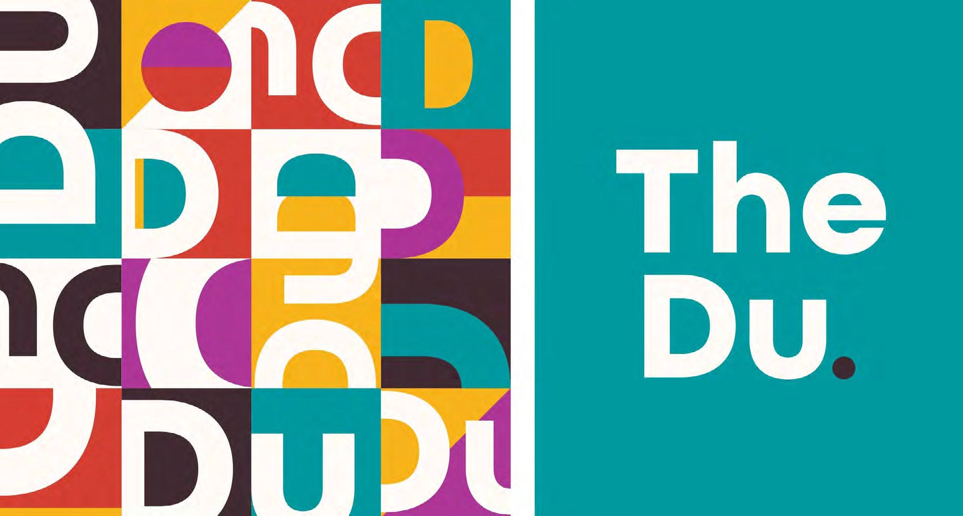
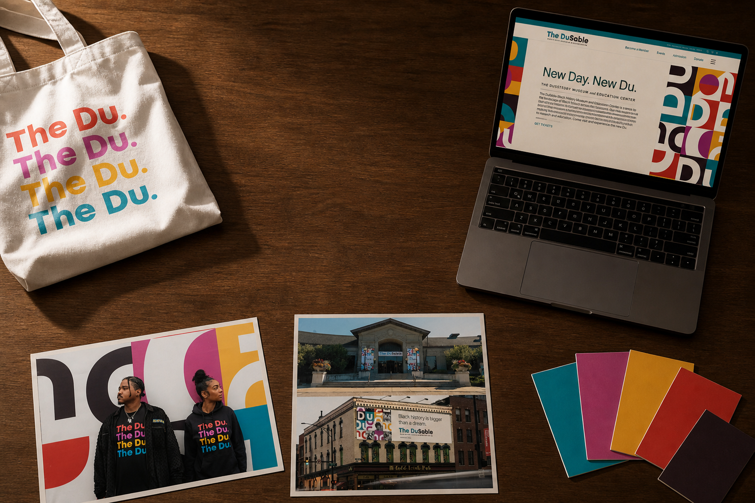
A new name and living visual language opened the institution to a broader audience without losing the history at its center.
Meet the new Du02 / DuSable

Build the world

Make the Moment
It's own Journey

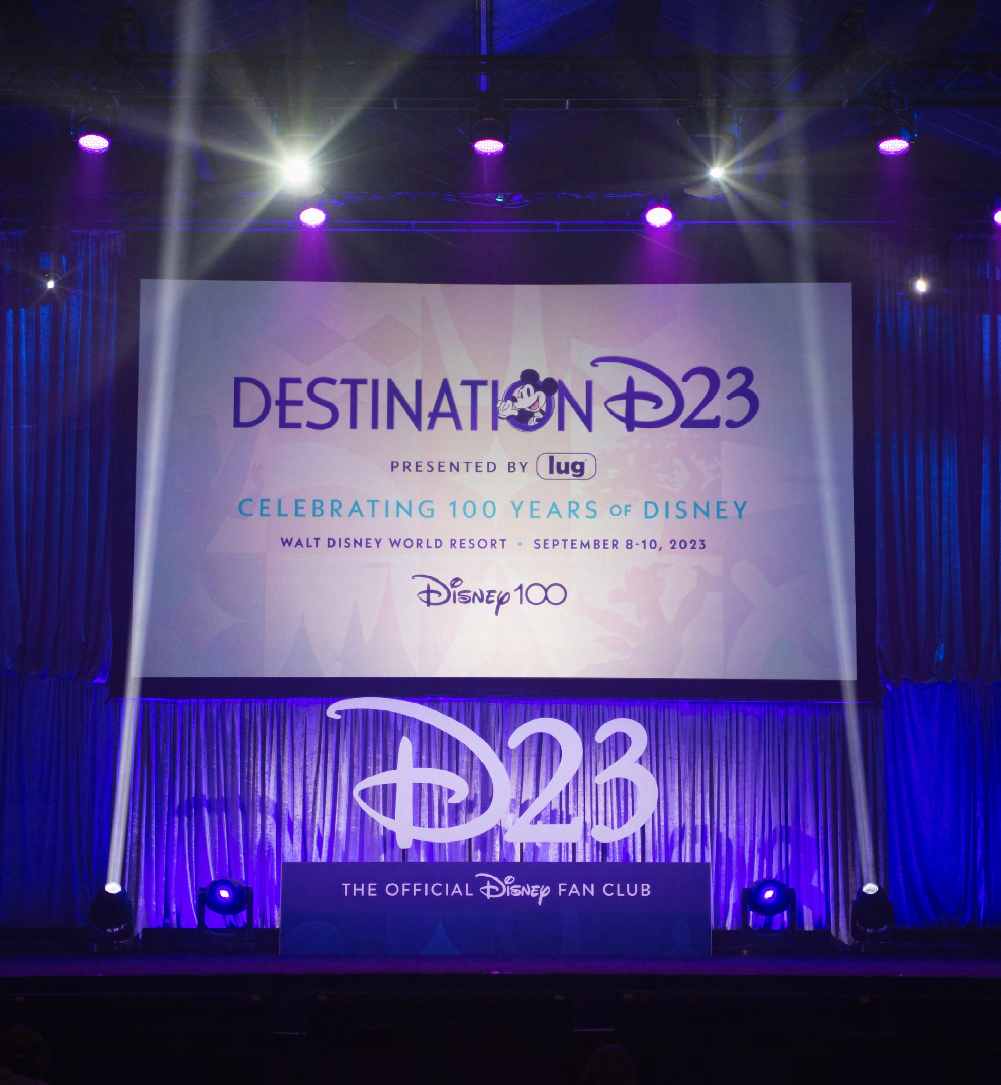
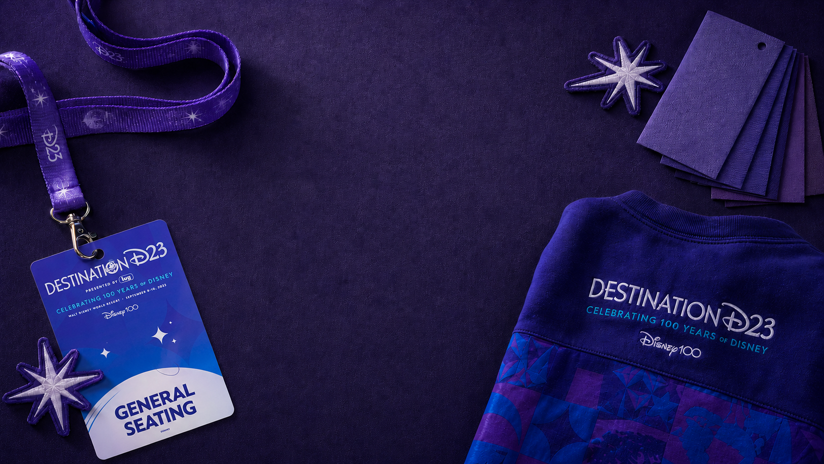
When every object belongs to the same story, the experience starts before the stage lights come up.

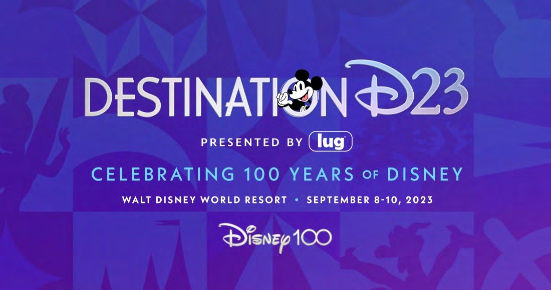
Enter Destination D2303 / Destination D23© Disney

Direct the scale

The Magic
Continues Here.

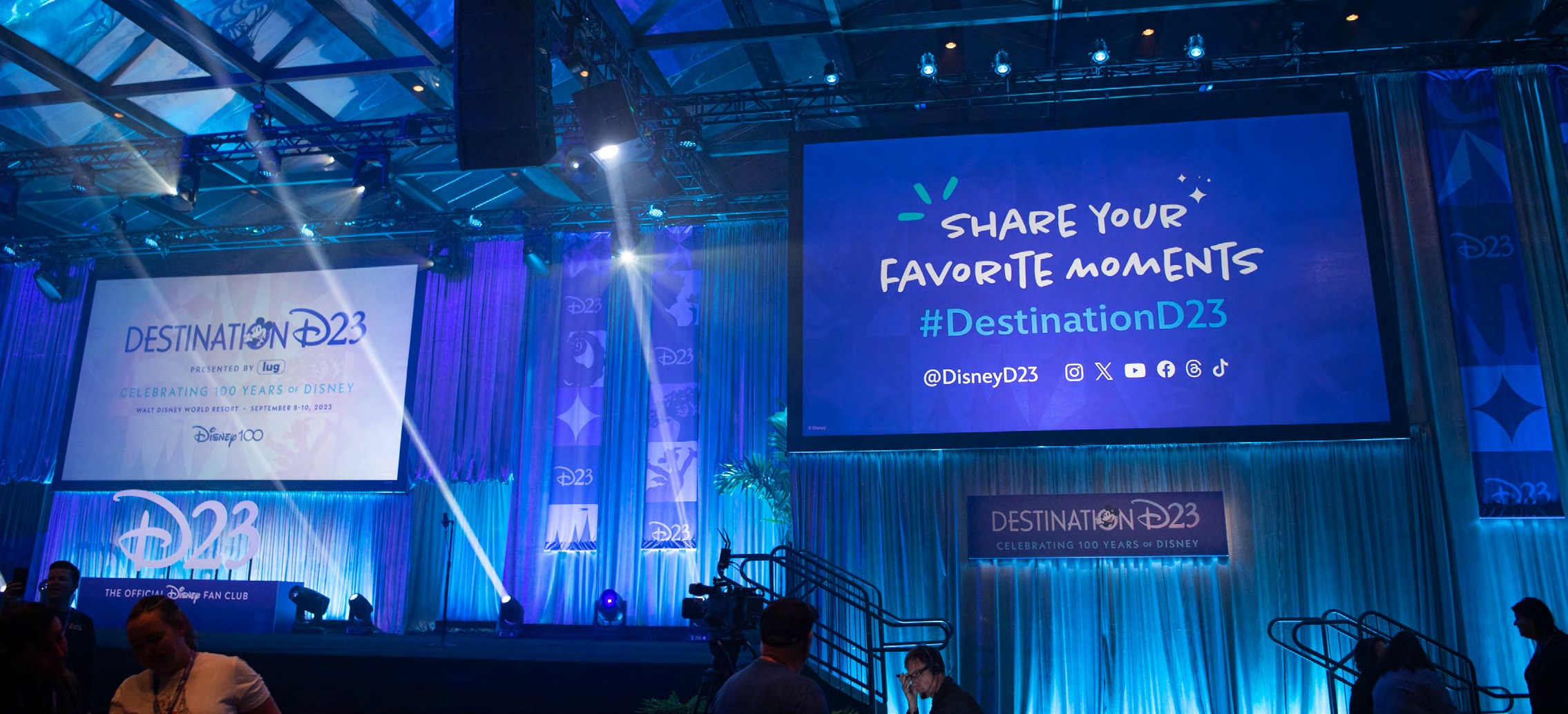
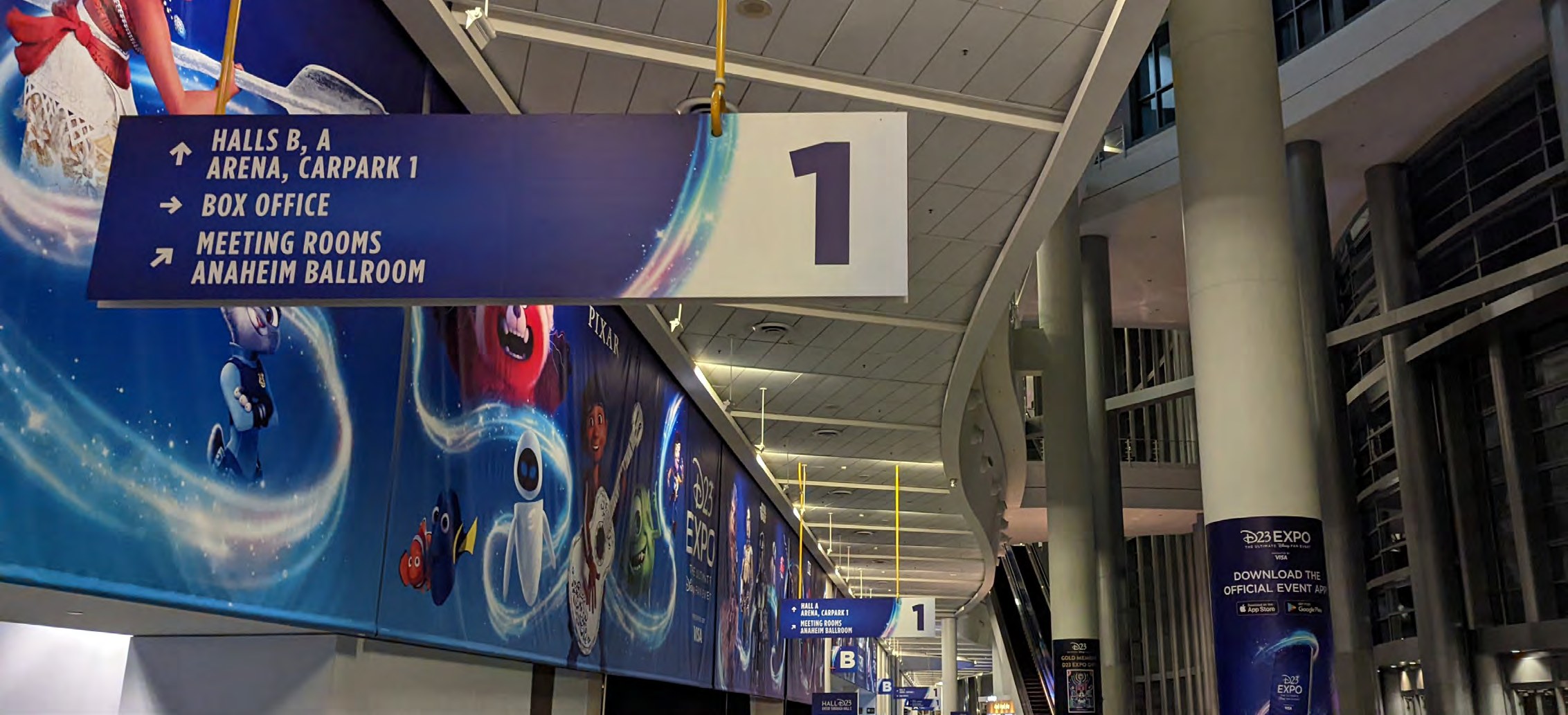
From credentials to displays, to the signs in the hall, every touchpoint worked together to build the experience.
Go inside D23 Expo04 / D23 Expo 2022© Disney

Keep the range. Keep the standard.

The Shape Changes
The Intent Remains.

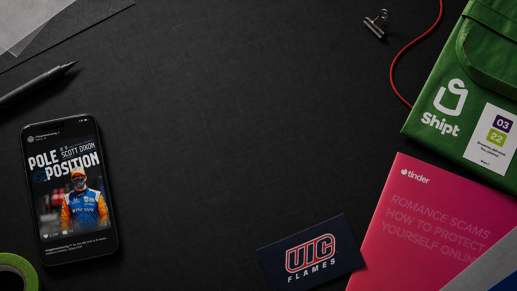
From racing and athletics to technology, retail, and culture—each world gets its own voice, built with the same level of care.

05 / Selected range

A few ways
into the work.

Eight focused case studies. The depth and breadth.

Selected collaborations

DisneyD23The DuSableULTA BEAUTYLA KINGSCHIP GANASSI RACINGUIC FLAMESshipttinderPRINGLESNORTHWESTERNPGA
← Back to the story

Case study · Destination D23 2023

100 years. One living world.

Making a century of Disney storytelling feel unified, contemporary, and emotionally immediate.

Context

A centennial with emotional weight
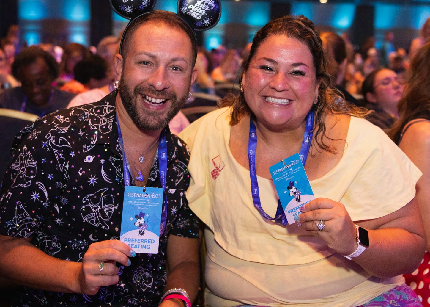
Destination D23 brought generations of fans, partners, and storytellers together for Disney’s global 100th anniversary celebration.

Challenge

Scale without fragmentation

One creative language had to span stages, merchandise, partner activations, digital touchpoints, retail, credentials, and guest movement.

Leadership

Primary creative ownership

I led the end-to-end brand and experiential system, guiding internal teams, vendors, and production partners toward one cohesive story.

Outcome

Heritage, elevated

A signature Disney100 purple world honored legacy while feeling modern, immersive, celebratory, and made specifically for fans.

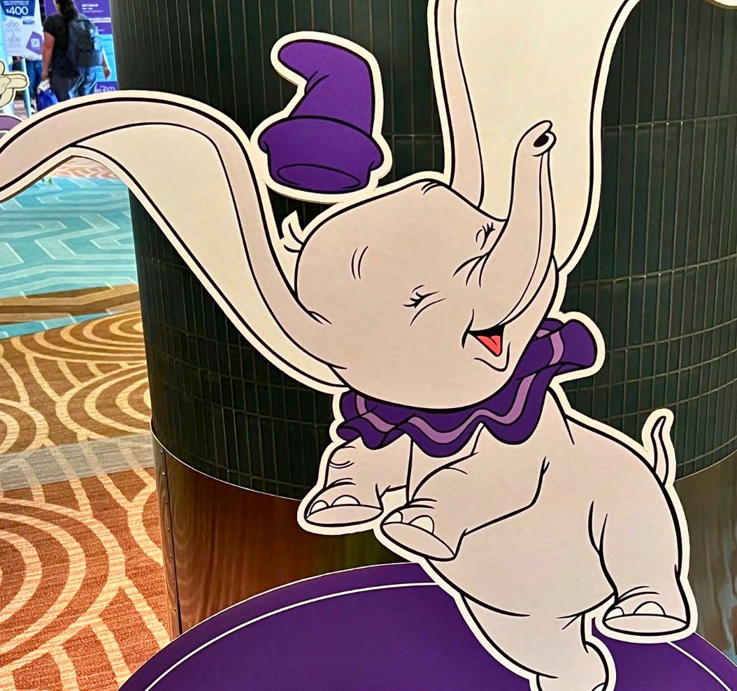
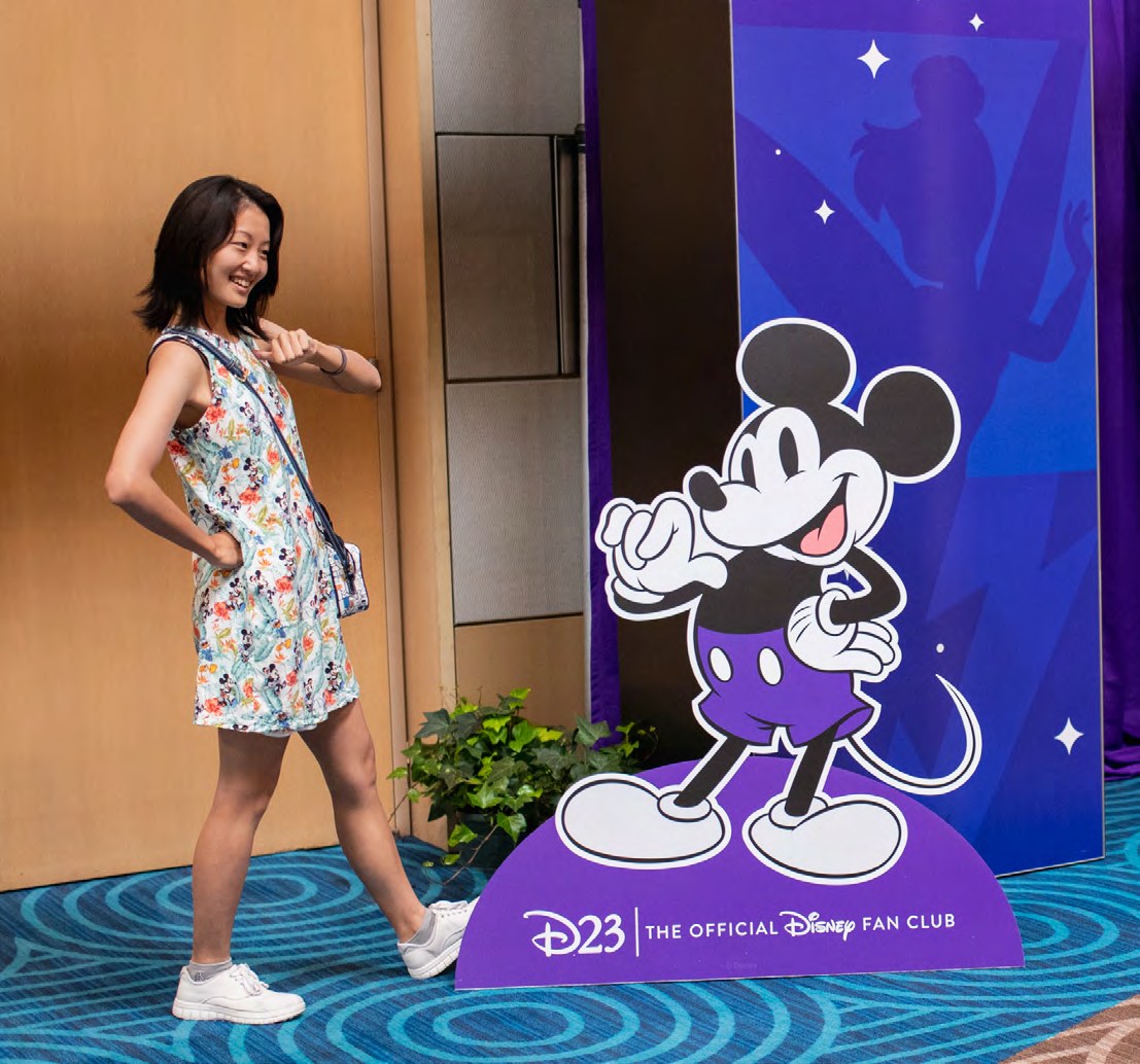
Destination D23 environmental and stage design for the Disney100 celebration, including custom character illustrations in Disney100 purple

A flexible framework

One purple world.
Every story welcome.

Contemporary graphic structures and the Disney100 palette created consistency without flattening the franchises, characters, and emotional registers inside the event.

The design intent

Make history feel
present tense.

The system did not treat one hundred years as a museum display. It gave the anniversary a living rhythm—one able to hold classic characters, contemporary programming, practical guest needs, and the unmistakable anticipation of a Disney fan gathering.

Destination D23 environmental and stage design for the Disney100 celebration, including custom character illustrations in Disney100 purple
Key Art
Destination D23 environmental and stage design for the Disney100 celebration, including custom character illustrations in Disney100 purple

Illustration & character

Nostalgia,
drawn by hand.

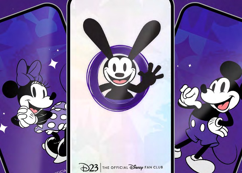
I created nearly 20 custom classic Disney characters in unique Disney100 purple attire. They became standing figures and environmental moments across signage, retail, merchandise, and the guest experience.

Destination D23 environmental and stage design for the Disney100 celebration, including custom character illustrations in Disney100 purple

Coverage & context

D23Disney100 and Destination D23News 6Disney welcomes fans to Destination D23
~20classic characters, drawn by hand
100years of Disney in one system
1purple world across stage, retail and credentials

The lasting idea

A century of stories.
The next one starts here.

One cohesive world connected generations of characters, partners, spaces, and fans without flattening what made each one distinct.

← Back to the story

Case study · DuSable Museum

New day. New Du.

A living identity for a cultural institution entering a more inclusive era.

Context

A pivotal public moment

The museum was evolving its name, positioning, and public presence while remaining deeply rooted in cultural legacy.

Thinking

Contemporary, never detached

The system had to feel current without erasing history—and broad enough to support exhibitions, education, and community engagement.

Process

A concept chosen to grow

My concept was selected through a competitive internal review, then expanded with a cross-functional team across platforms and activations.

Impact

A living visual language

Modular, expressive, and adaptable: one recognizable voice moving fluidly between cultural, digital, and environmental contexts.

The inflection point

Change the name.
Open the frame.

The shift to The DuSable Black History Museum and Education Center was more than nomenclature. It was an opportunity to make the institution’s purpose more immediate, its welcome more expansive, and its visual presence as alive as the history it carries.

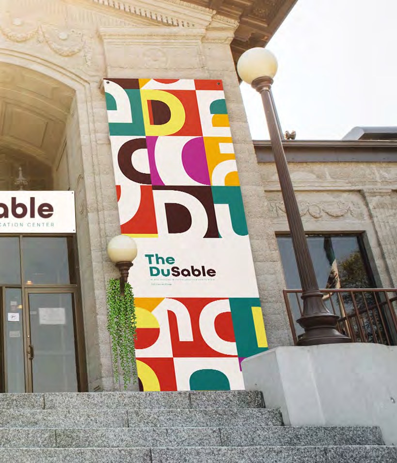
Detail of the DuSable modular letterform pattern

The system

One name.
Many voices.

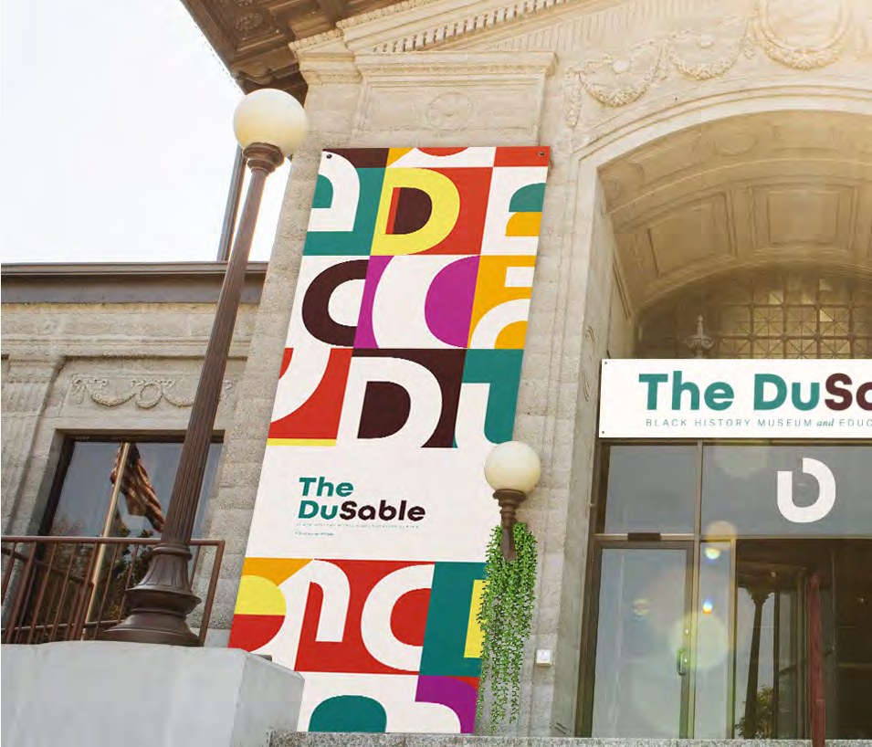
Large-scale letterforms became a visual library rather than a single locked mark. Cropped, repeated, recolored, and paired with photography, the system could shift tone without losing recognition.

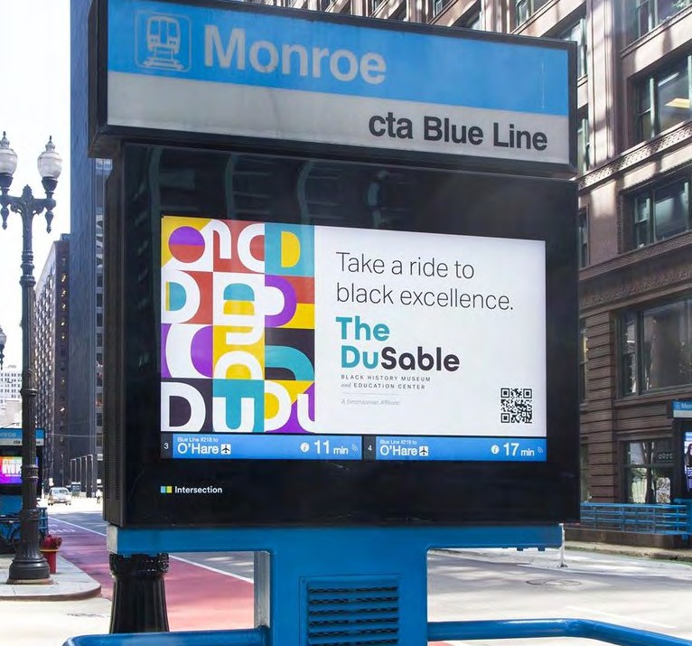
The DuSable brand applied to a CTA transit screen in downtown Chicago
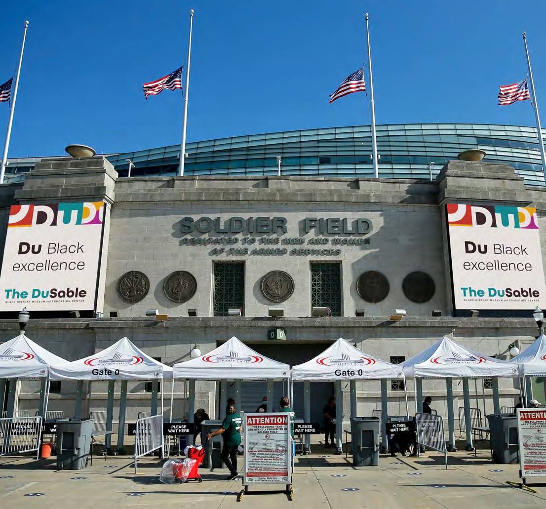
The identity moves beyond the museum and into the city.Environmental application
The DuSable identity system: a modular grid built from cut letterforms in red, teal, yellow and purple, alongside the teal "The Du." lockup
Digital expression built from the same modular language.
Crowds gathered outside The DuSable under the new banners on opening weekend
A flexible system that remains recognizable on everyday objects.
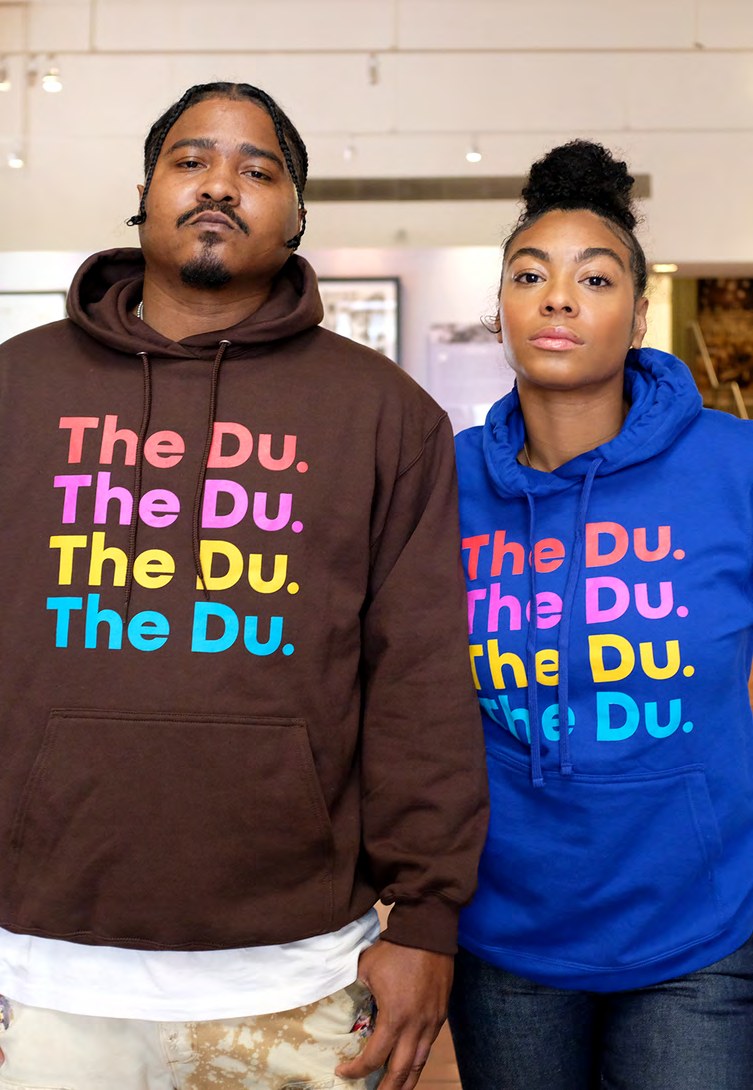
Two people wearing The Du. hoodies in the museum shop

The public voice

Wear the institution.
Carry the story.

Apparel and objects gave the new identity a social life outside the galleries—turning a museum mark into a point of pride, invitation, and community recognition.

Coverage & context

Chicago Sun-TimesDuSable museum gets a rebrandDuSable MuseumA More Inclusive Era of the Du
GoldPCC Golden Trumpet Awards 2023, Branding
SilverThe Gail Awards 2023, Branding
1961the founding the new name still carries

The lasting idea

History is alive.
The identity should be too.

A flexible system made to carry memory, culture, and momentum into the museum’s next chapter.

← Back to the story

Case study · D23 Expo 2022

The biggest stage. One Disney world.

A flexible environmental system built for the scale, variety, and anticipation of Disney’s ultimate fan event.

Context

Disney’s largest fan event

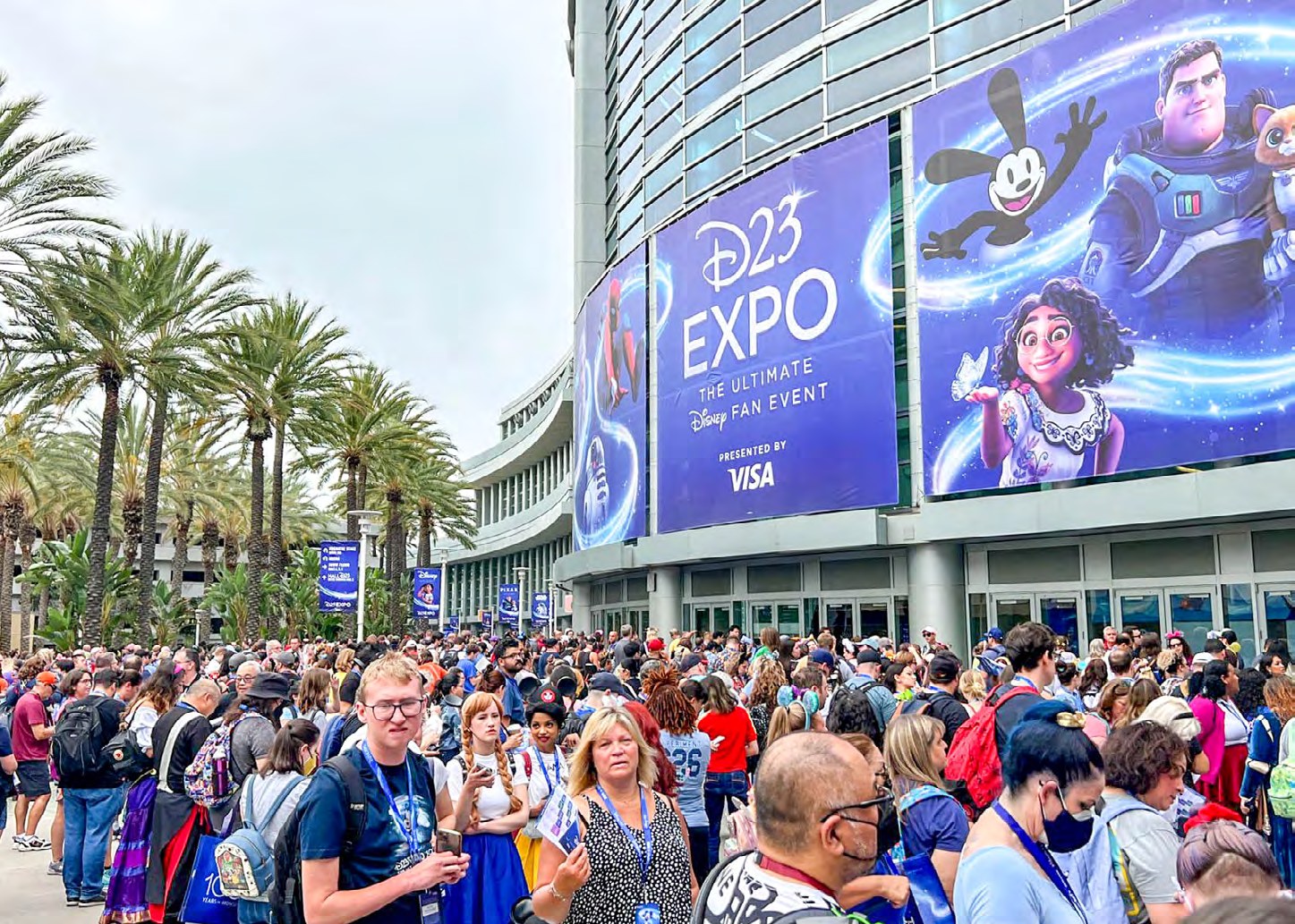
Multiple franchises, partners, and audiences had to coexist inside a single experience without becoming a collection of disconnected zones.

Challenge

Design at convention scale

The system needed to flex across enormous environments while staying clear, legible, exciting, and unmistakably Disney.

Process

Small team, large ecosystem

Working within a focused internal team, I helped shape the visual framework and coordinated with production partners to bring it into the built world.

Impact

Anticipation, everywhere

Adaptable frameworks carried brand heritage into contemporary stages, screens, signage, merchandise, and the full guest journey.

The organizing principle

Every world belongs.
The event still reads as one.

The creative problem was not simply making a large event look spectacular. It was creating a shared horizon across Disney’s full portfolio—one strong enough to connect every threshold and touchpoint, yet flexible enough for each story to retain its own voice.

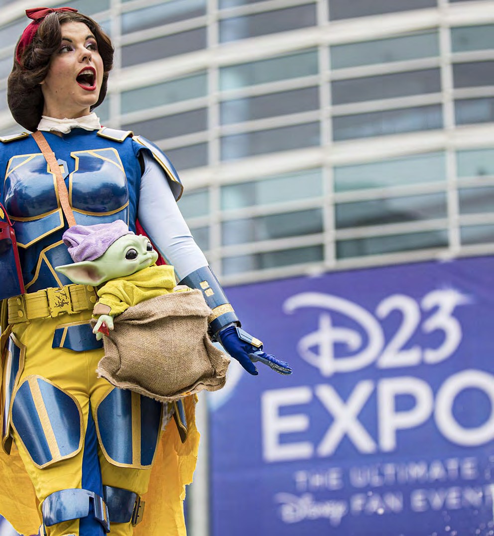
D23 Expo 2022 environmental branding, wayfinding and large-format signage across the Anaheim Convention Center

Stage & ceremony

Scale needs
a clear hierarchy.

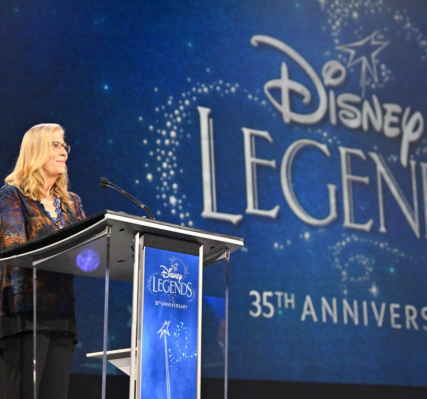
At presentation scale, typography, framing, sightlines, and motion had to communicate instantly. The visual system supported the emotional weight of the programming without competing with it.

D23 Expo 2022 environmental branding, wayfinding and large-format signage across the Anaheim Convention Center
The event framework scales from brand marks to guest-facing applications.Identity in use
D23 Expo 2022 environmental branding, wayfinding and large-format signage across the Anaheim Convention Center
Production-ready assets designed for consistency across formats.
D23 Expo 2022 environmental branding, wayfinding and large-format signage across the Anaheim Convention Center
A shared visual atmosphere carries the experience through the venue.

Coverage & context

Los Angeles TimesWhat the D23 Expo meant for Disneyland’s futureD23The biggest presentations at D23 Expo 2022
3days, September 9–11, 2022
Disney100the centennial kicked off here
Everyfranchise, one horizon

The lasting idea

The biggest stage.
One unmistakable world.

A system broad enough to hold every story and clear enough to make the whole event feel connected.

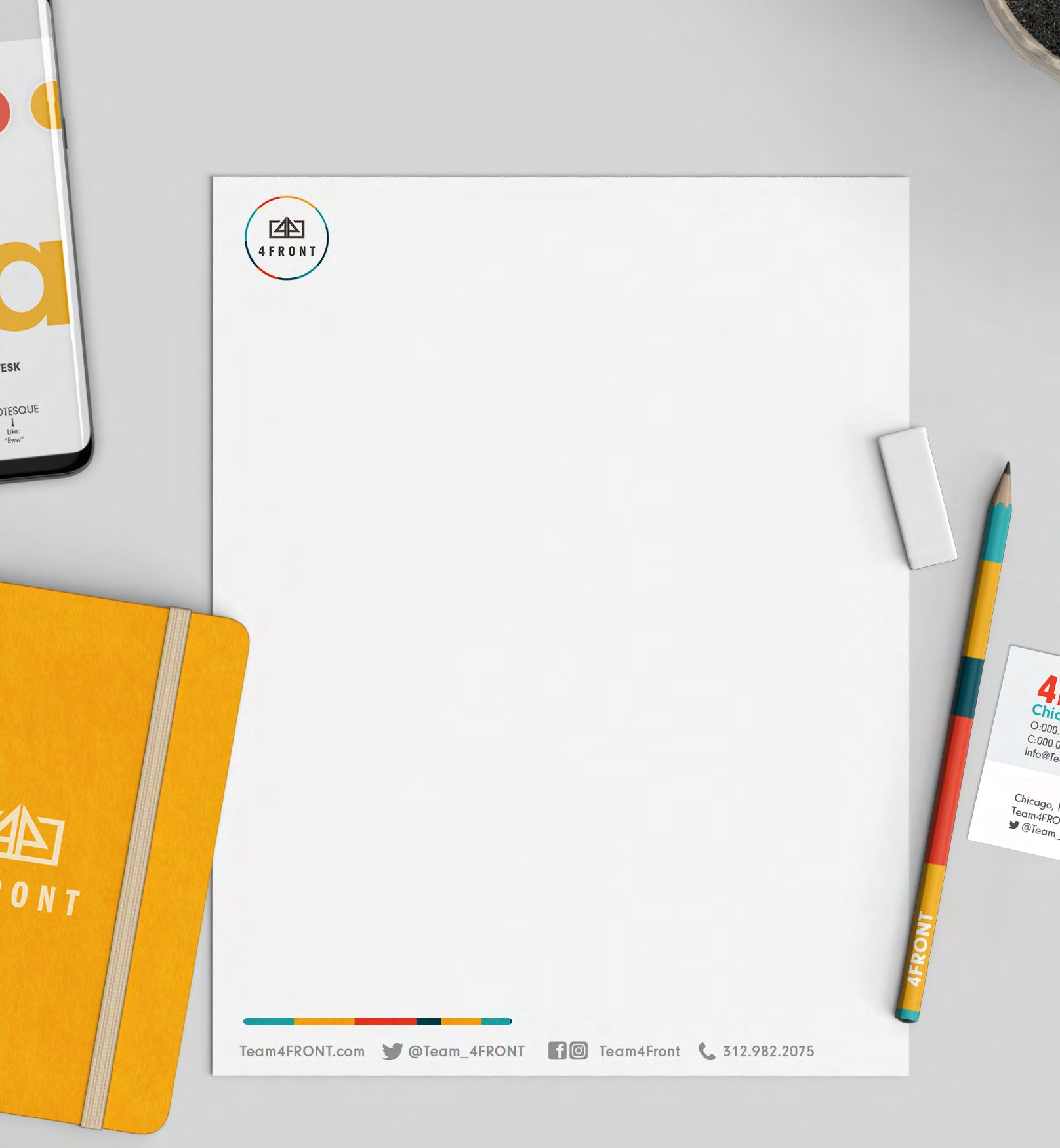
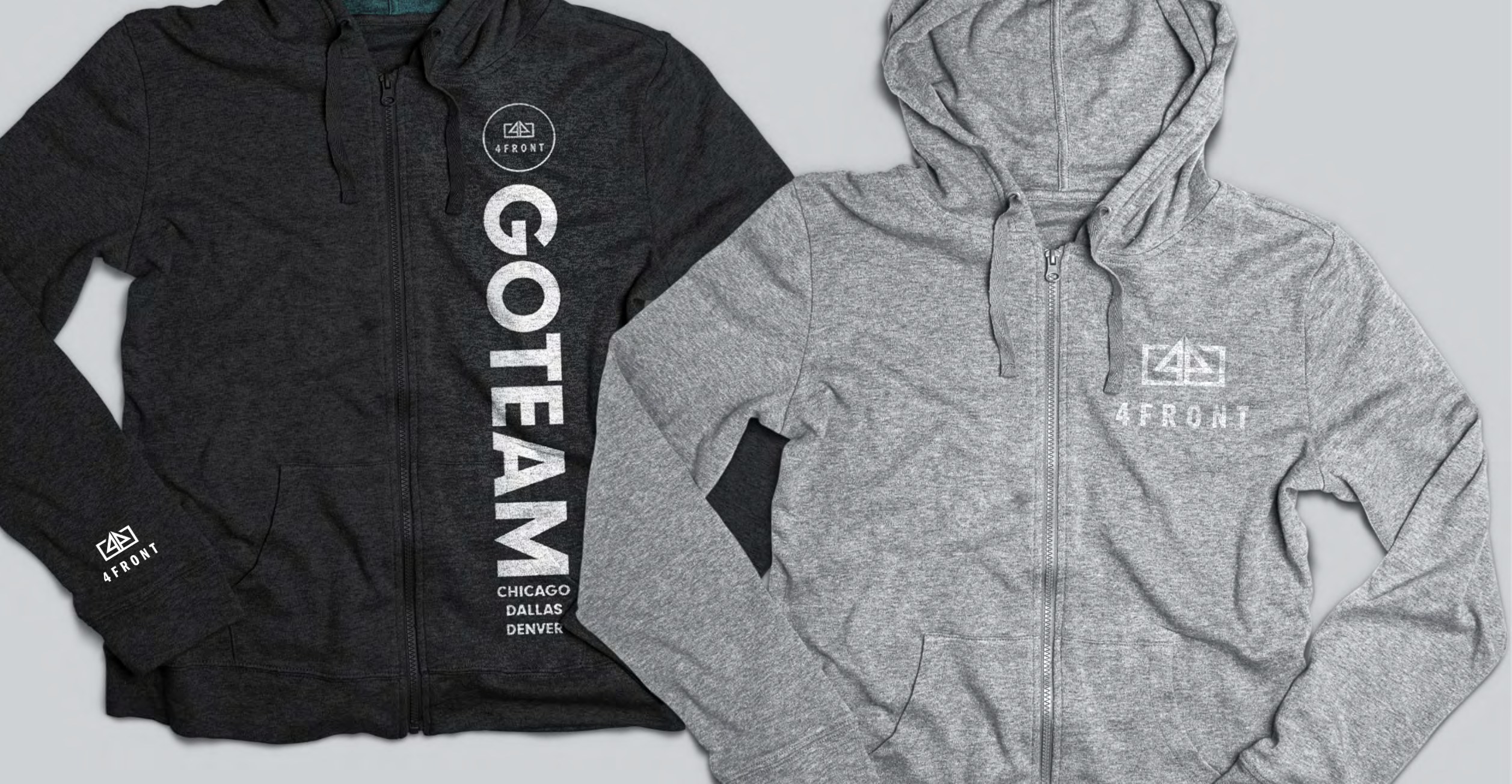
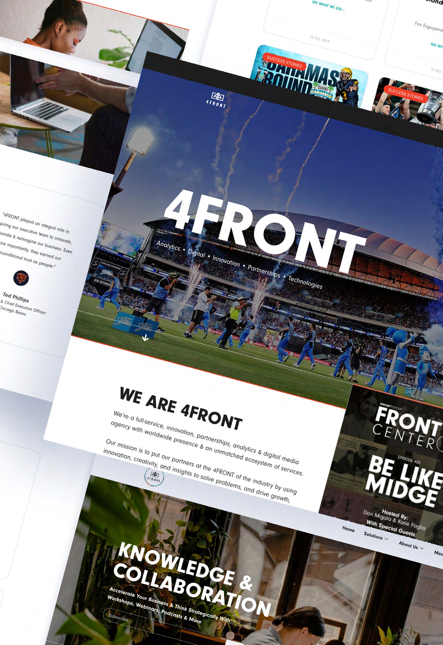
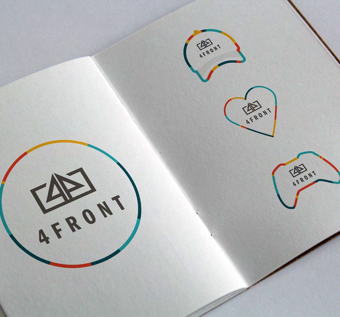
4FRONT brand identity applied across stationery, apparel, iconography and the company website
← Back to the story

Case study · 4FRONT

A growing agency finds its voice.

A brand system built to express the full range of a sports and entertainment business moving forward.

Context

More than a new name

The business had expanded beyond what its inherited identity could communicate.

Thinking

Four capabilities, one front

A modular visual language could make breadth feel focused rather than scattered.

Process

Make the strategy visible

Turn positioning into a recognizable identity teams could confidently use.

Execution

Built for the field

The system flexed from thought leadership and presentations to apparel and activation.

Coverage & context

Sports Business JournalPCG SportsDesk rebranding to 4FrontSports Business Journal4Front moves into its next stage of growth
4capabilities, one front
3cities: Chicago, Dallas, Denver
2018PCG SportsDesk becomes 4FRONT

The lasting idea

One voice.
Built to move culture.

A sharper system gave a growing team the clarity and range to show up with confidence across every opportunity.

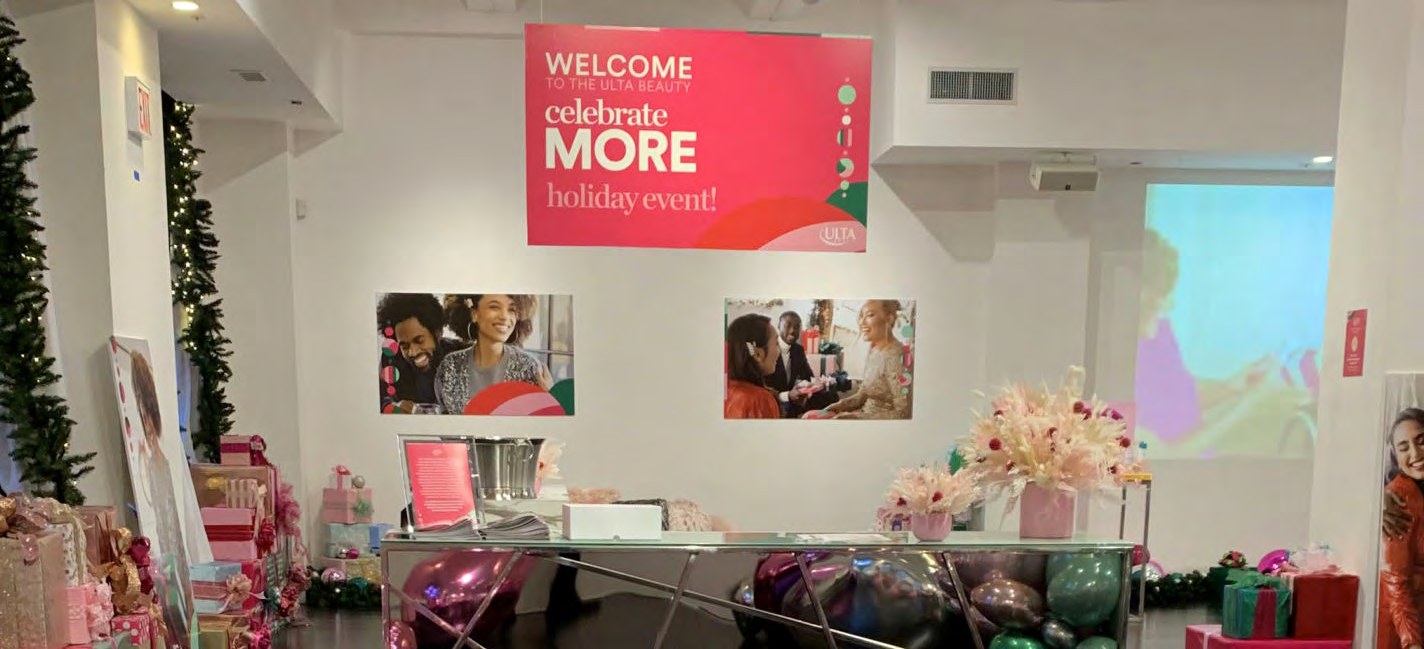
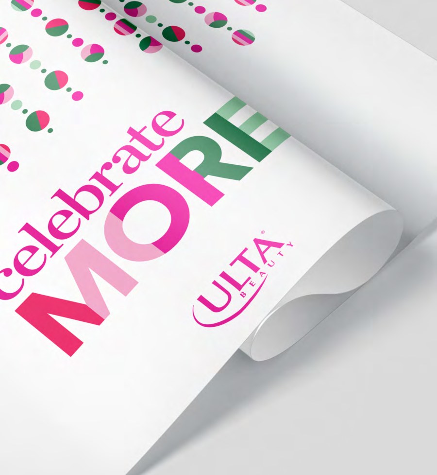
Ulta Beauty Celebrate More holiday influencer event: environmental graphics, printed collateral and branded backdrops
← Back to the story

Case study · Ulta Beauty

Celebrate more.

Turning an approved holiday idea into a complete influencer experience guests could walk through, photograph, and remember.

The assignment

Turn an approved idea
into a room.

The holiday idea was signed off before we arrived. The job was to make it physical on a live build clock — an influencer experience guests could walk through, photograph and remember — without reinterpreting a brand that wasn't ours to change.

Context

Holiday, made physical

An influencer gathering needed to translate Ulta Beauty’s seasonal creative into a coherent real-world experience.

Thinking

Make every angle belong

Each guest-facing surface could reinforce the campaign while still giving the event room to feel social and spontaneous.

Process

From direction to detail

Interpret the approved brand language, map it to the venue, and prepare every asset for production.

Execution

A camera-ready world

Wayfinding, scenic moments, backdrops, and print worked together as one polished holiday environment.

Coverage & context

Ulta BeautyBeauty IRL: event experiences
Portfolio contextSole execution lead across environmental signage and printed assets

The lasting idea

Every detail can make
the celebration feel bigger.

The campaign became more than a look—it became a place people could enter and carry into their own content.

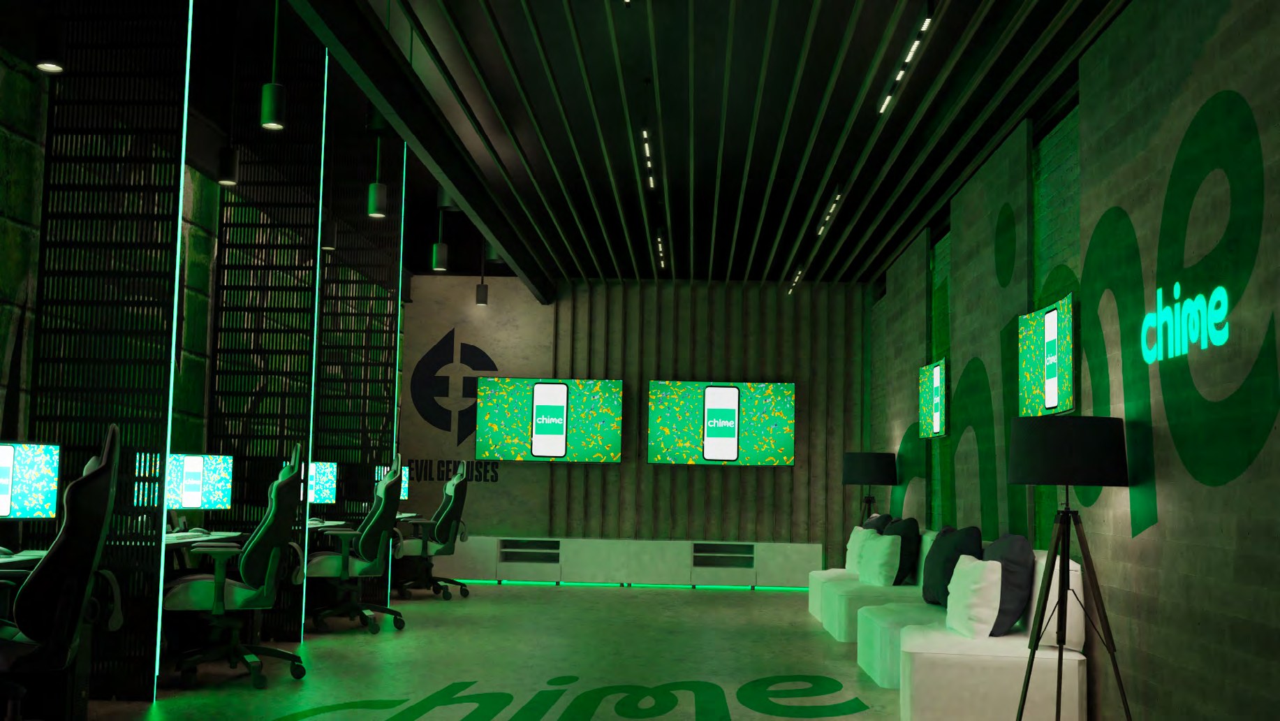
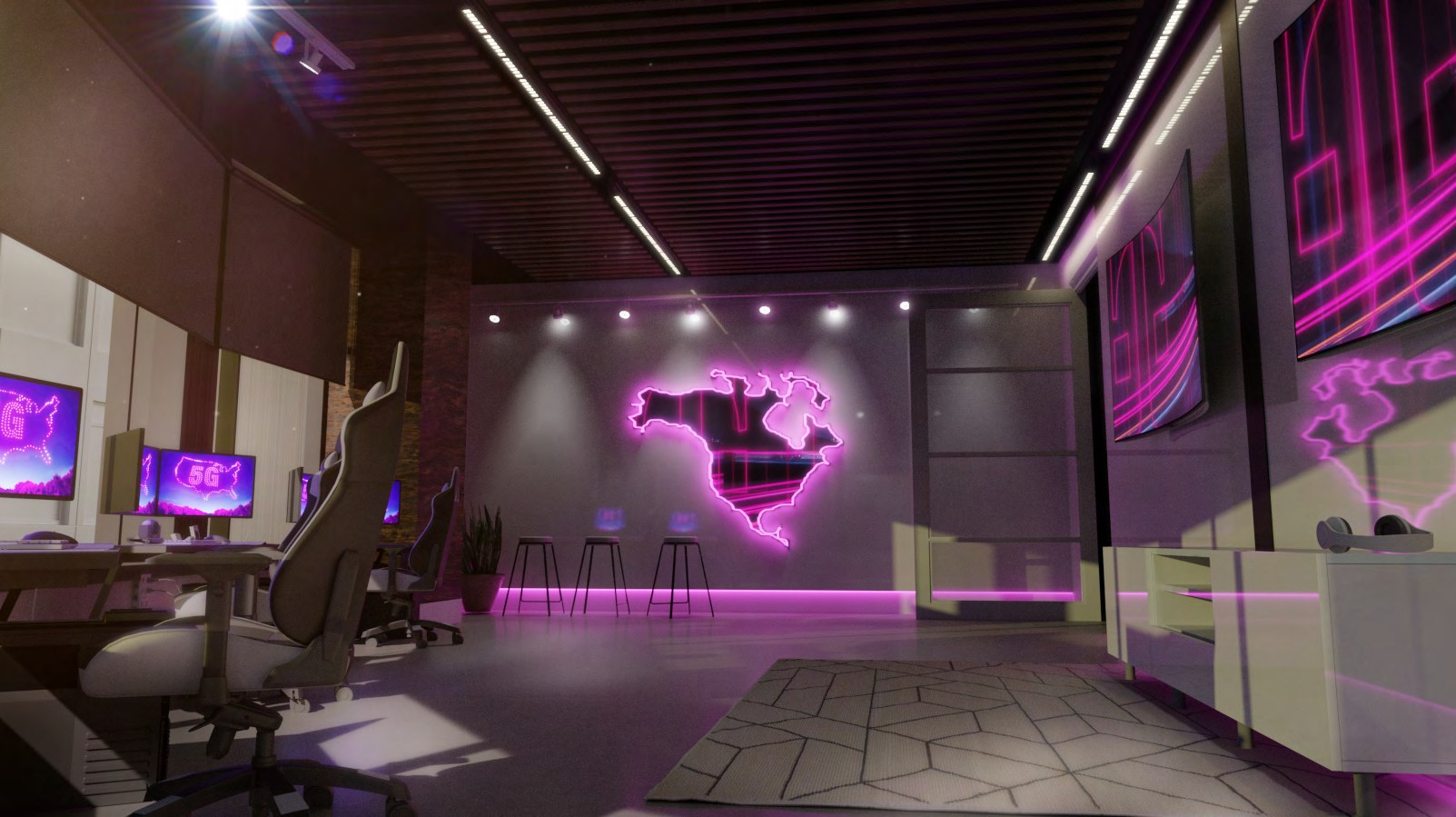
Evil Geniuses headquarters 3D visualisation showing sponsor-integrated environments
← Back to the story

Case study · Evil Geniuses Headquarters

Make the future visible.

Site-specific 3D environments designed to turn sponsorship possibilities into something partners could already believe in.

The assignment

Sell a sponsorship
that doesn't exist yet.

Site-specific 3D environments for the Evil Geniuses headquarters, built to turn sponsorship possibilities into rooms a partner could already believe in. The render had to be real enough to sign against and open enough to change once the deal was done.

Context

A headquarters with value

The new space needed to serve the team while giving prospective sponsors credible, ownable moments within it.

Thinking

Show, don’t ask them to imagine

Detailed visualizations could make every integration legible before construction or commitment.

Process

Brand meets architecture

Study the site, identify high-value surfaces, and build concepts that feel native to both the sponsor and the team.

Execution

Proposals with presence

Photoreal environments brought the opportunity to life inside sponsorship decks and partner conversations.

Coverage & context

Evil GeniusesThe organization behind the environment
Portfolio contextVisualizations developed for sponsor proposal decks

The lasting idea

A proposal gets powerful
when people can enter it.

Spatial storytelling closed the distance between an abstract opportunity and a partner’s future presence.

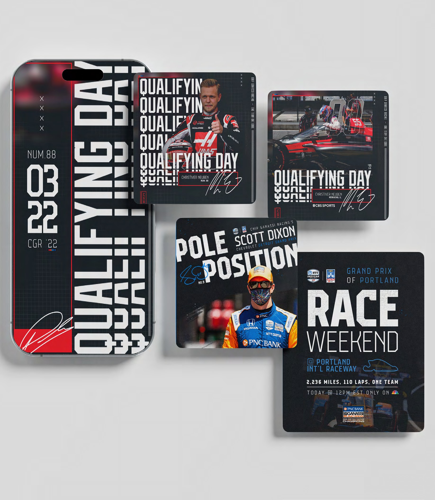
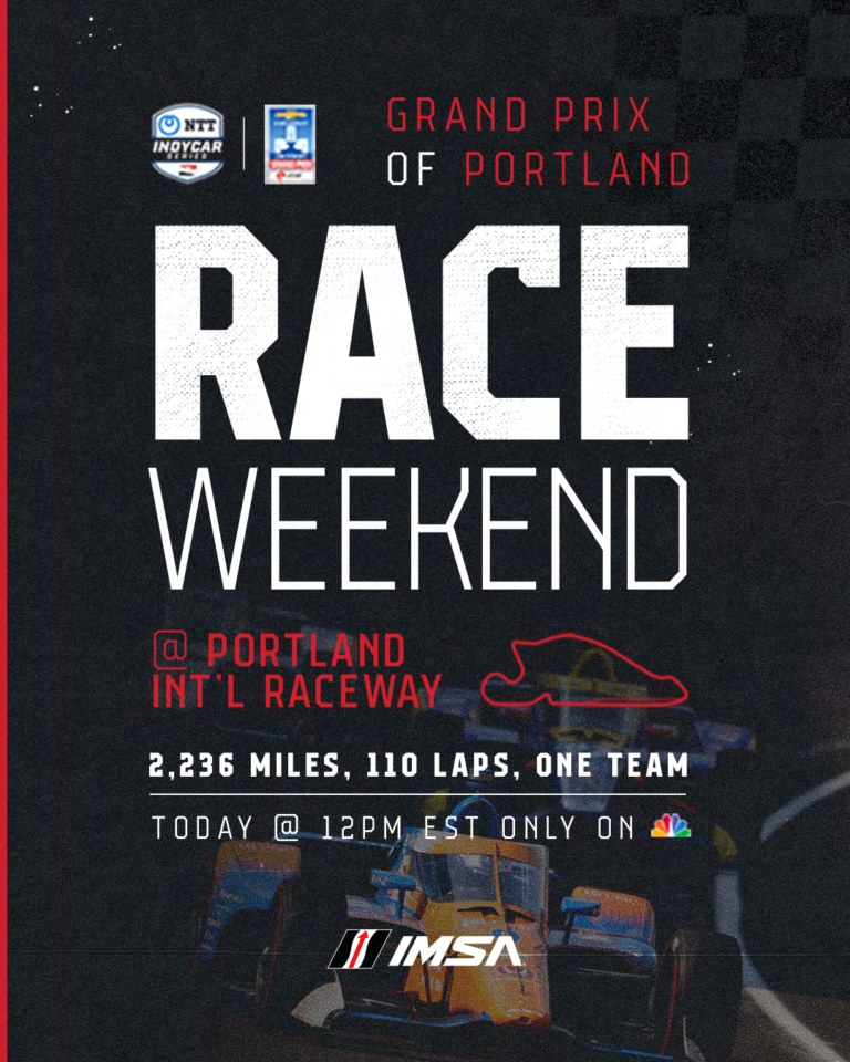
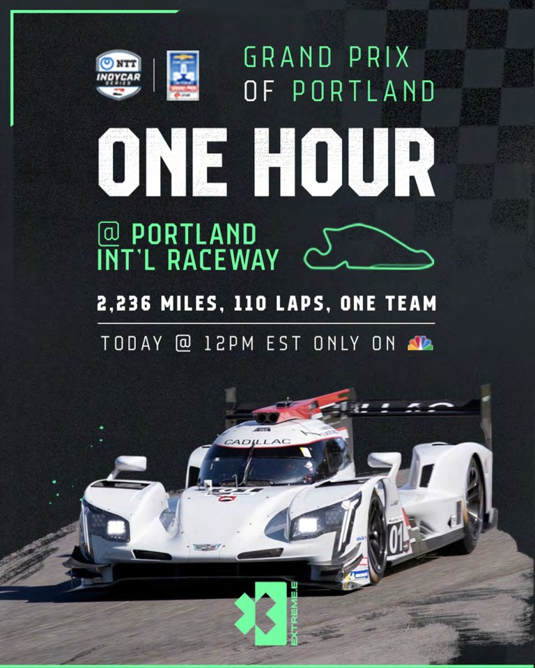
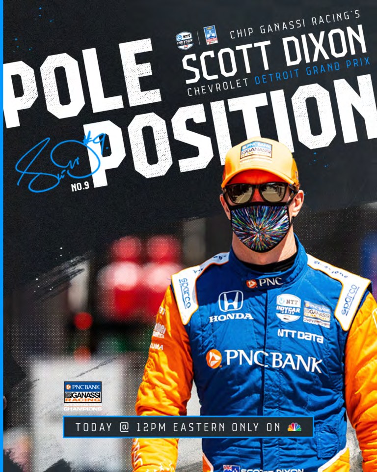
Chip Ganassi Racing social templates across IndyCar, Extreme E and IMSA, showing race-day and driver layouts
← Back to the story

Case study · Chip Ganassi Racing

Personality and grit, with the legacy intact.

Creative direction and production design for a social and digital imagery system spanning Chip Ganassi Racing's three core programs — IndyCar, Extreme E and IMSA — built so the team could raise partner value and tell stories beyond the car and the fire suit. Roughly one hundred social and digital templates with example content, built for internal customisation. The system carries mood, history and the personalities of the drivers, and it holds its shape when the team is producing at race-weekend speed.

The assignment

Three series.
One voice.

Chip Ganassi Racing is one of the most decorated teams in American motorsport, and in 2022 it was running three very different programs at once: IndyCar, Extreme E and IMSA. The social feed looked like it. The ask was a single imagery system with enough personality to carry drivers, partners and history, and enough structure that the in-house marketing team could produce a race weekend without calling a designer.

Context

A feed that looked like three teams

Each program had its own sponsors, its own palette of livery colours and its own audience. The channel had to serve all of them and still read as Chip Ganassi Racing first.

Thinking

Personality and grit, legacy underneath

The team's history is the asset nobody else has. The system leans on it — the wins, the drivers, the blue-collar roots — and gives each series a lane of its own inside the same frame.

Process

Templates the team can drive

Three core layouts, one per series, with variants for results, partner features, driver stories and race-day moments. Every template shipped with example content so the marketing team could see the intent and swap in the real thing.

Execution

Beyond the car and the fire suit

More room for partners and more ways to tell a story: the system diversified what a post could be without diluting what the team looked like.

3racing programs in one system
~100templates with example content
In-houserun by the team, not by us
Chip Ganassi Racing social templates across IndyCar, Extreme E and IMSA, showing race-day and driver layouts

Coverage & context

Chip Ganassi RacingThe team, its programs and its record
Studio noteDelivered as Arkane Society in 2022; the studio is now Prairie & Forge.

The lasting idea

A system that runs
at race-weekend speed.

The measure of a social system is not the first post; it is the hundredth, made on a Sunday night by someone who was never in the room. This one was built for that person.

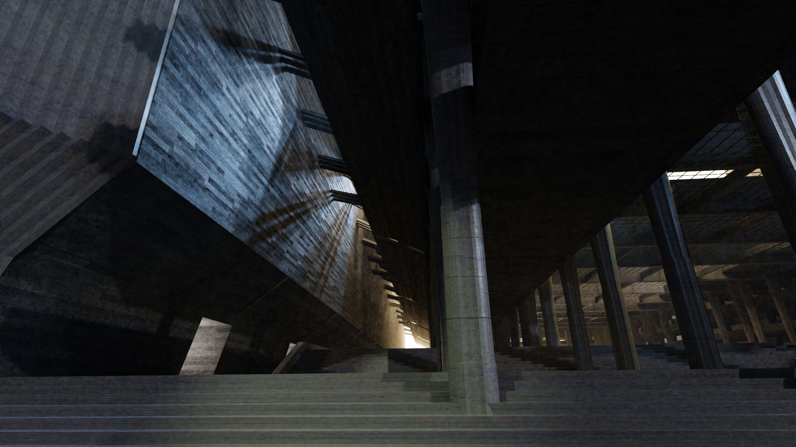
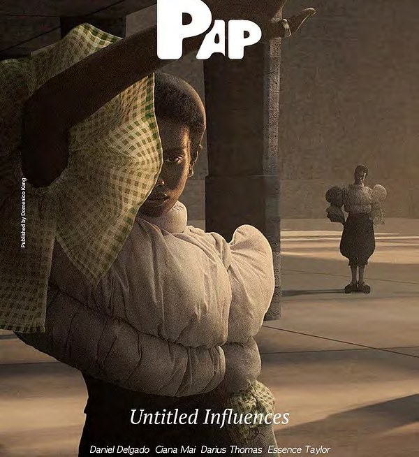
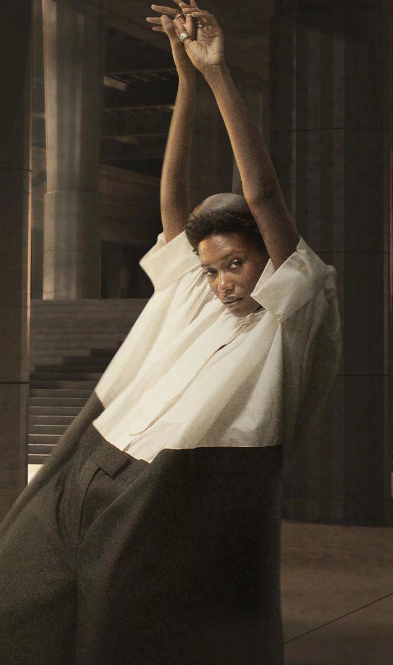
Untitled Influences: a constructed 3D environment of vast concrete architecture and raking light, with figures in sculptural garments
← Back to the story

Case study · Untitled Influences

Build the world behind the image.

An editorial experiment in making subconscious influence tangible through invented environments.

The assignment

Show influence
without depicting it.

An editorial experiment for PAP Magazine: make subconscious influence tangible using only space, material and light. No figures, no products, no text in the frame — just invented environments doing the persuading.

Context

Influence is everywhere

The series explored the forces that shape our taste and choices before we consciously recognize them.

Thinking

Make the invisible sublime

An alternate reality could turn atmosphere, scale, and symbolism into part of the portrait.

Process

Compose beyond the camera

Extend the image through 3D space, graphic intervention, and a controlled dialogue between figure and environment.

Execution

Portrait as world-building

Each final image became less a backdrop and more a complete emotional landscape.

Coverage & context

Editorial premiseA constructed reality about the influences we absorb without noticing
Creative contextPhotography, 3D environment, and graphic design working as one image

The lasting idea

Influence becomes visible
when the world is invented.

The environment gave subconscious forces a scale, texture, and atmosphere the camera alone could not hold.

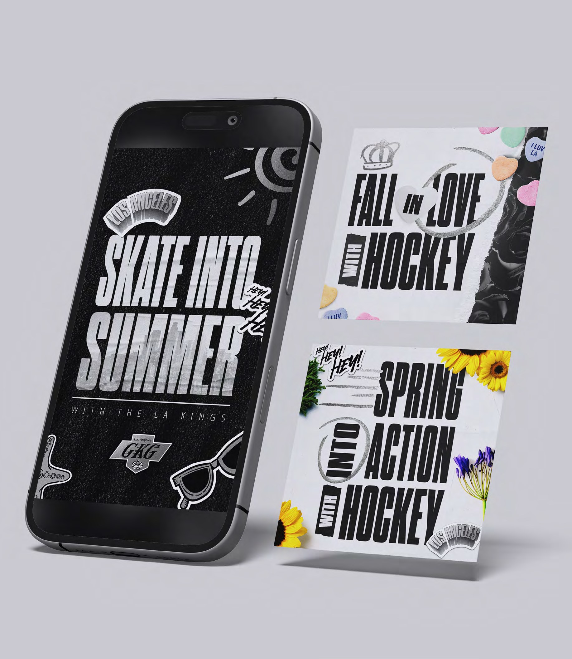
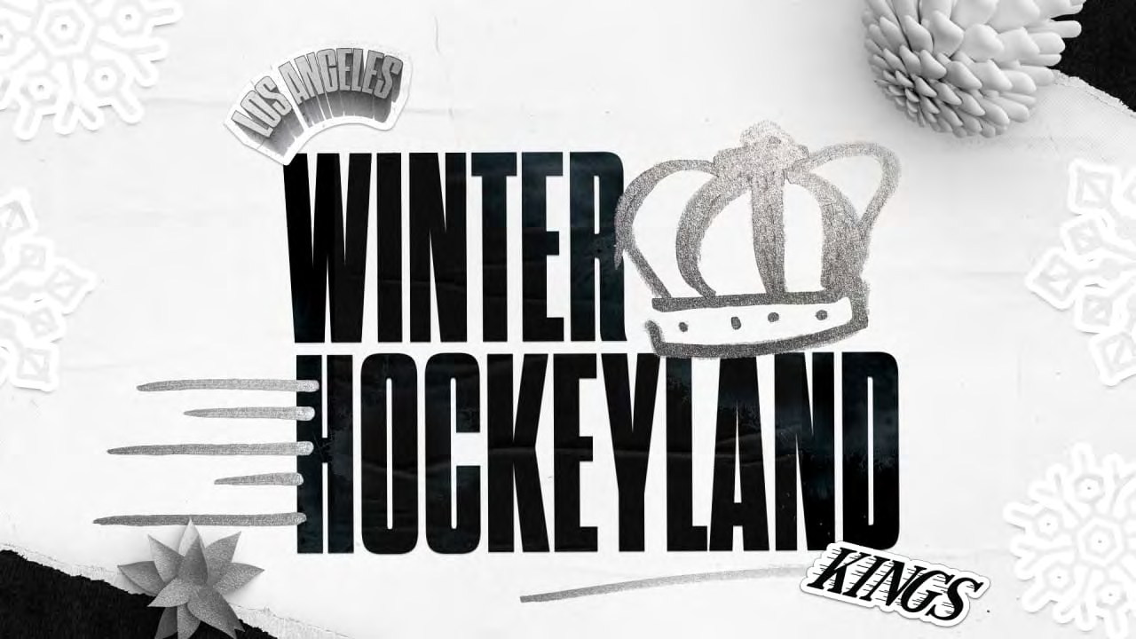
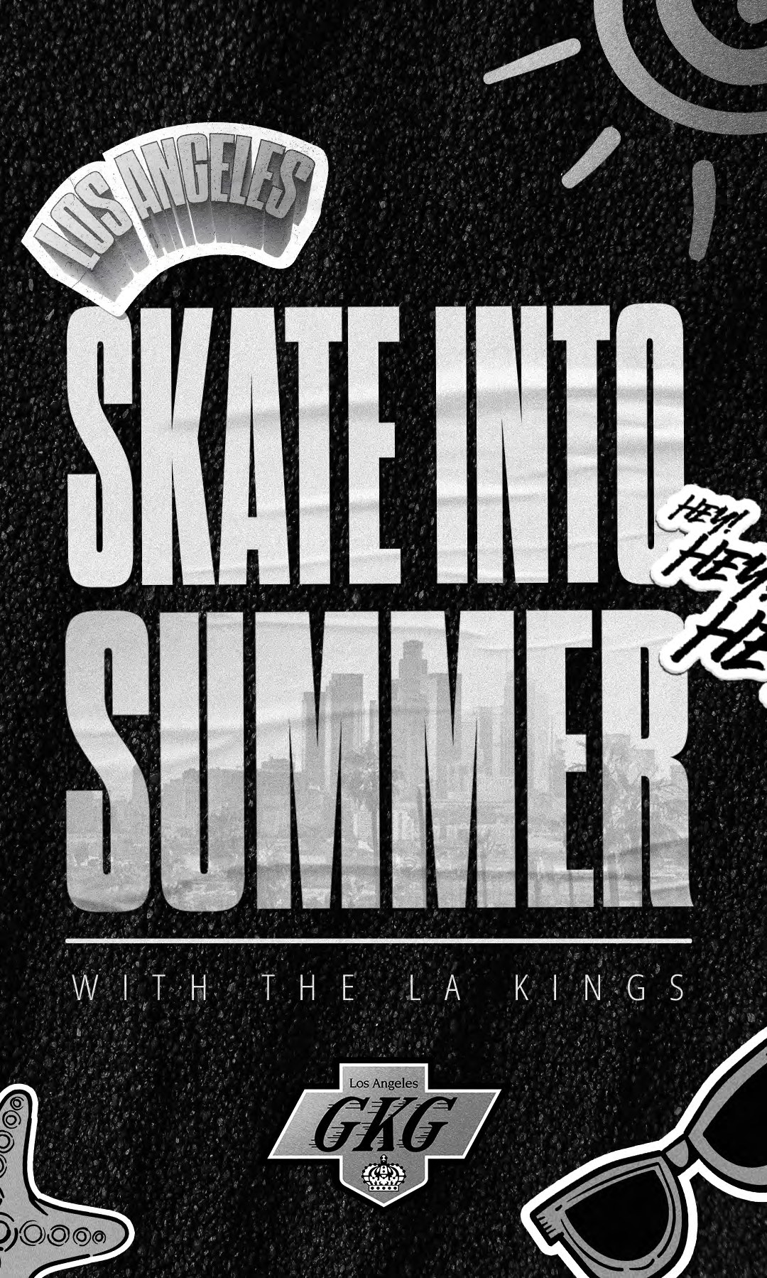
LA Kings youth seasonal campaign graphics and activity sheets
← Back to the story

Case study · LA Kings · Seasonal Moments

Make every season feel like game day.

A flexible stream of social campaigns and illustrated activities that kept the team present through cultural moments, holidays, and family rituals.

The assignment

One team. Many moments.

The Kings needed content that could move at the speed of the social calendar without losing the attitude of the team. Seasonal graphics delivered immediate, shareable energy while hand-drawn coloring sheets made the brand participatory for younger fans and families.

Context

Fandom between games

The content calendar needed ideas that could keep the team culturally present far beyond the arena.

Thinking

Match the energy to the moment

Build each beat around a seasonal insight, then translate it into either an immediate social statement or an invitation to participate.

Process

Fast, specific, unmistakably Kings

Pair graphic shorthand with detailed illustration so the work could flex from a quick scroll-stopper to a slow, hands-on family activity.

Execution

A full-season content system

Social graphics and printable illustrations gave the team multiple ways to enter holidays, cultural moments, and everyday fandom.

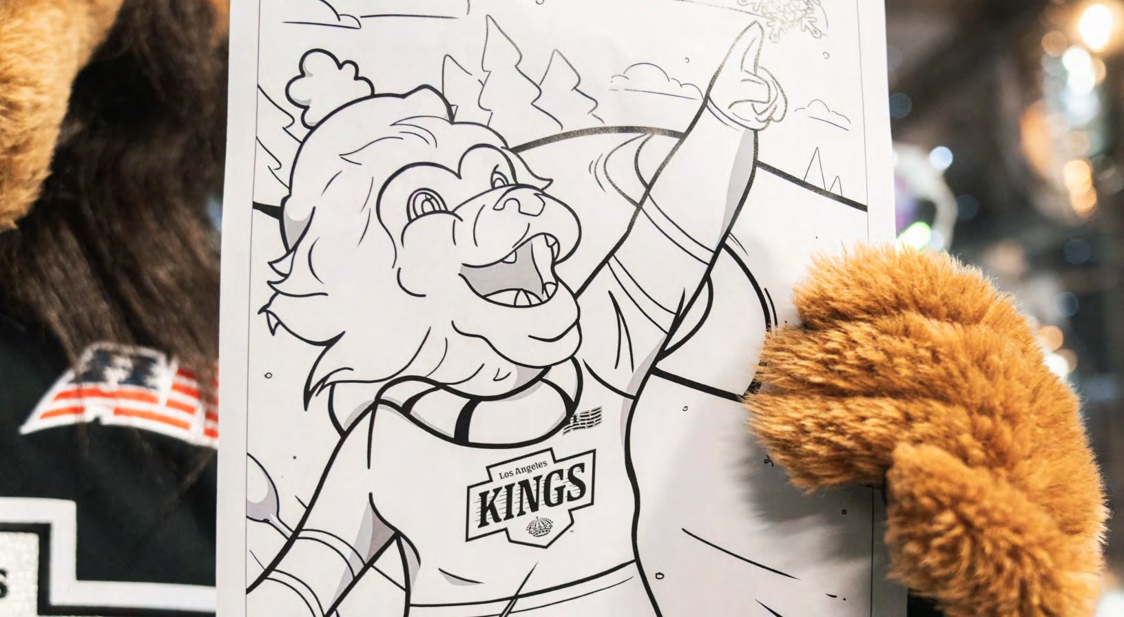
LA Kings youth seasonal campaign graphics and activity sheets

From shareable to participatory

Give the audience a line of their own.

The same seasonal thinking expanded into pages fans could finish themselves. Team symbols, mascots, and Southern California references became generous, recognizable scenes designed to reward every age and skill level.

Coverage & context

LA KingsSpring activities and seasonal coloring sheets
Portfolio contextSeasonal campaigns paired scroll-stopping social moments with illustration fans could make their own.

The lasting idea

The calendar changes.
The connection keeps moving.

A living stream of moments made the brand timely, playable, and present in the rituals that surround the season.

LA Kings youth seasonal campaign graphics and activity sheets
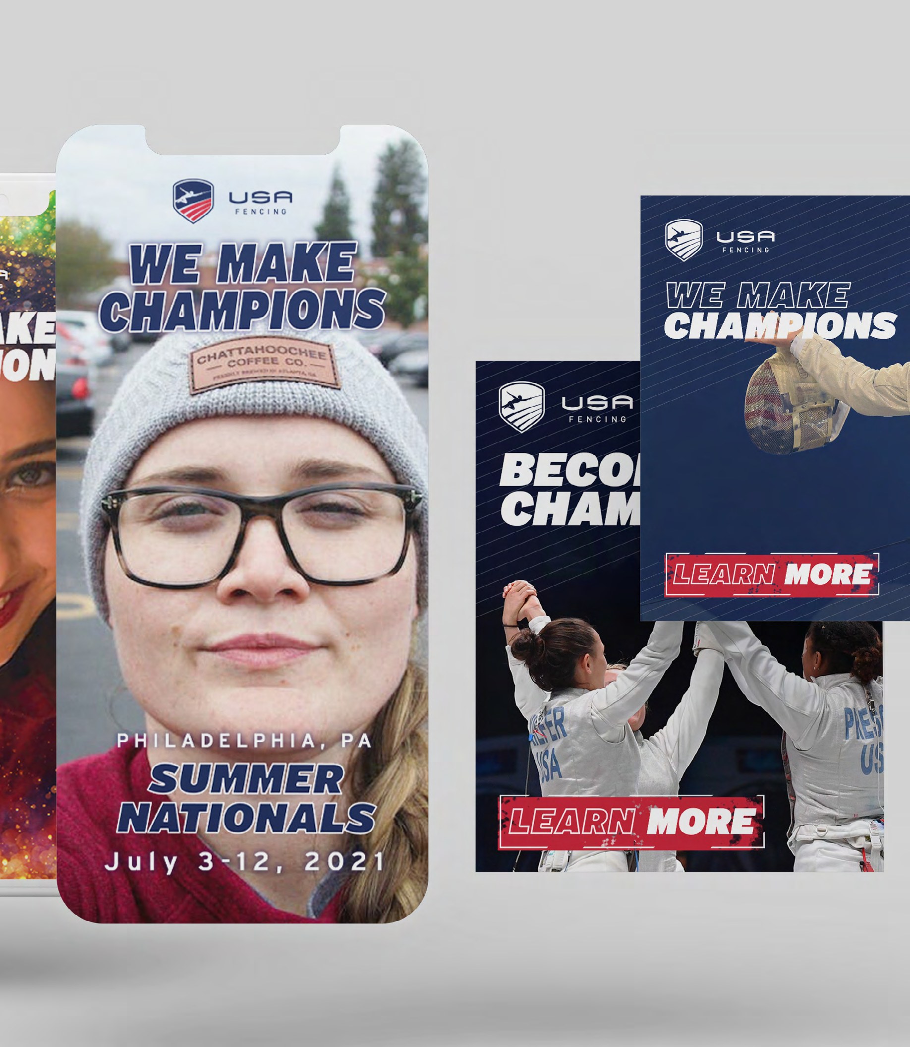
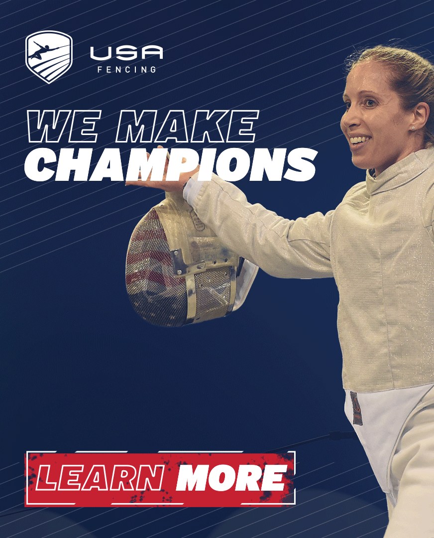
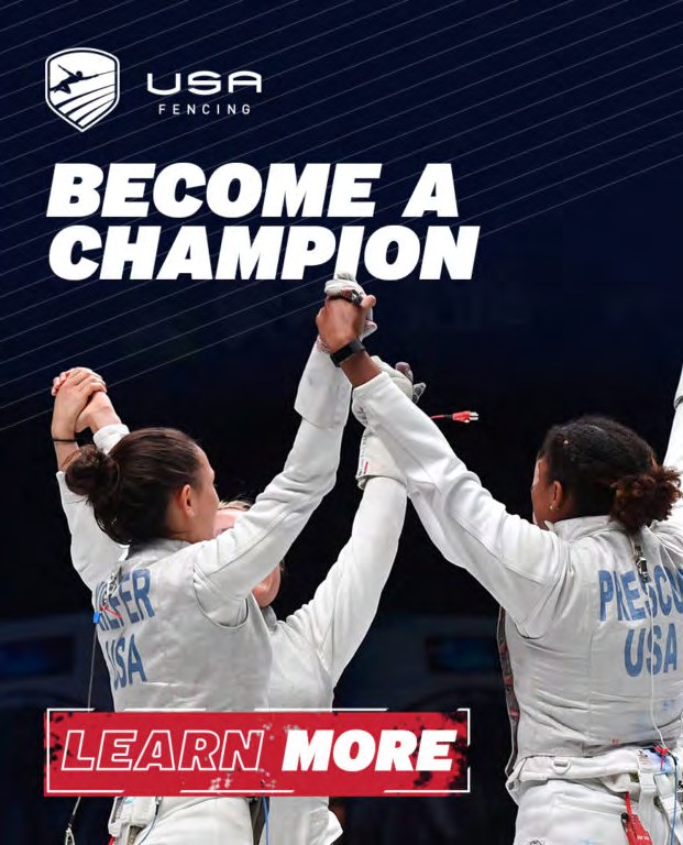
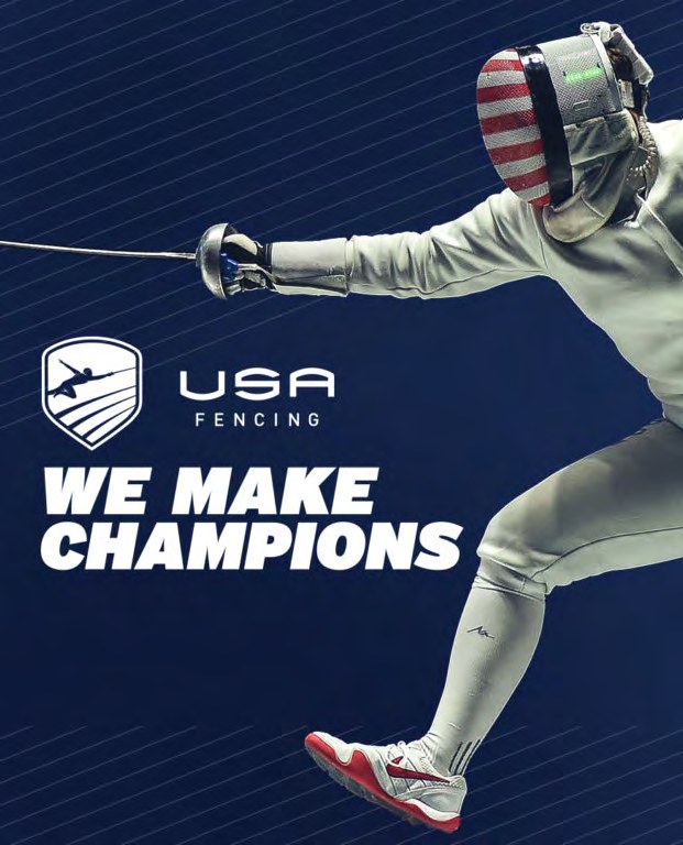
USA Fencing We Make Champions campaign across social and digital banner placements
← Back to the story

Case study · USA Fencing

Champions are built before the podium.

Two complementary campaigns for USA Fencing in the lead-up to and through the Tokyo Olympic Games — one social-forward, one led by digital banners — deployed across social, digital, Olympic-period fan touchpoints and on-site materials for clubs and venues. The positioning held that USA Fencing builds champions through discipline, preparation and community, not podium finishes alone: a story the sport could tell every week of the year, not only in the weeks when everyone is watching medals.

The assignment

Position a sport
around preparation.

In an Olympic summer the whole world looks at podiums. USA Fencing, the national governing body for a sport that lives in clubs and gyms the other three years, needed a campaign that could ride the Games without depending on results — and give the fencing community something to hold onto once the cameras left.

Context

A sport that peaks every four years

Attention arrives with the Games and leaves with them. The campaign had to work as hard on a Tuesday in a club as on the night of a final.

Thinking

Discipline, preparation, community

Champions are built in the years before the podium. Positioning the sport around what it takes rather than what it wins made the story true for every fencer in the country, medal or not.

Process

Two campaigns, one voice

A social-forward system for the moment-to-moment of the Games, and a digital banner system for the season around them. Same language, different pace.

Execution

From the feed to the club wall

Social, digital banners, Olympic-period fan touchpoints and on-site materials, so the same idea reached a fan online and a twelve-year-old walking into practice.

2campaigns, one positioning
Tokyothe Olympic window they ran through
Club to feedon-site materials and social, same voice
USA Fencing We Make Champions campaign across social and digital banner placements

Coverage & context

USA FencingThe national governing body
Studio noteDelivered as Arkane Society in 2021; the studio is now Prairie & Forge.

The lasting idea

The podium is a moment.
The preparation is the sport.

A positioning built on what it takes, not what it wins, gave the community a story that outlasts any single Games.

About Darius.

Good ideas deserve a world.

I’m a creative director and moment maker working across brand, experience, environment, storytelling, and the systems that hold them together. If the challenge needs clarity, imagination, and someone who can carry the idea through execution, let’s talk.

Start a conversation

What are we making?

Your contact details are sent securely and are not published on this site.

Portfolio snapshots · Private download

The living story.
A take-with-you edition.

A downloadable selection for hiring teams, collaborators, and the moments when a PDF is still the right format.

Protected access

Enter your access code.

The final access code and private Drive handoff will be set in the secure backend before launch.